UmbiTeams
su-re.co
UI/UX redesign for a climate adaptation organisation
- UI/UX
- Web Design
The Challenge
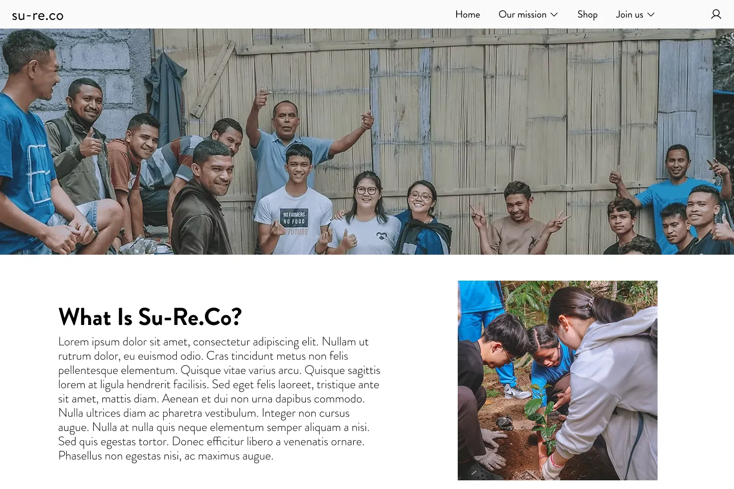
su-re.co publishes a lot of substantial work, from field programmes to funded climate projects to a student programme. The site gave all of it the same weight. Long paragraphs, flat headings, and inconsistent templates meant visitors had to read everything just to find anything.
Approach
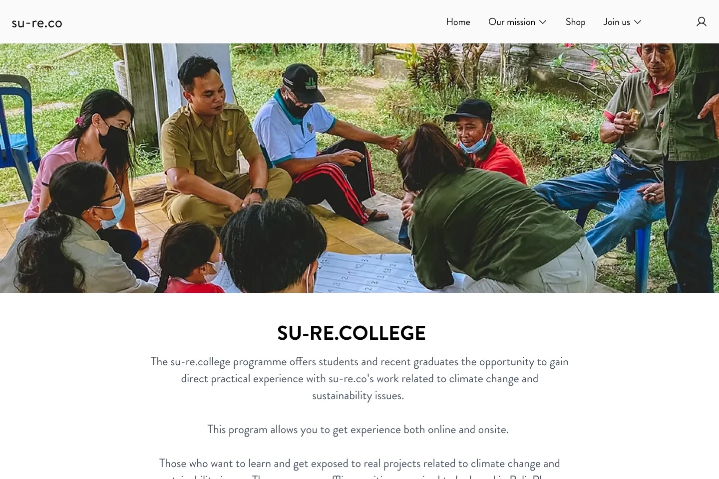
We worked with the existing design instead of starting over. We set a clear type scale, broke long copy into scannable blocks, and put programme pages and project detail pages on one shared layout, so the pattern only needs to be learned once.
Outcome
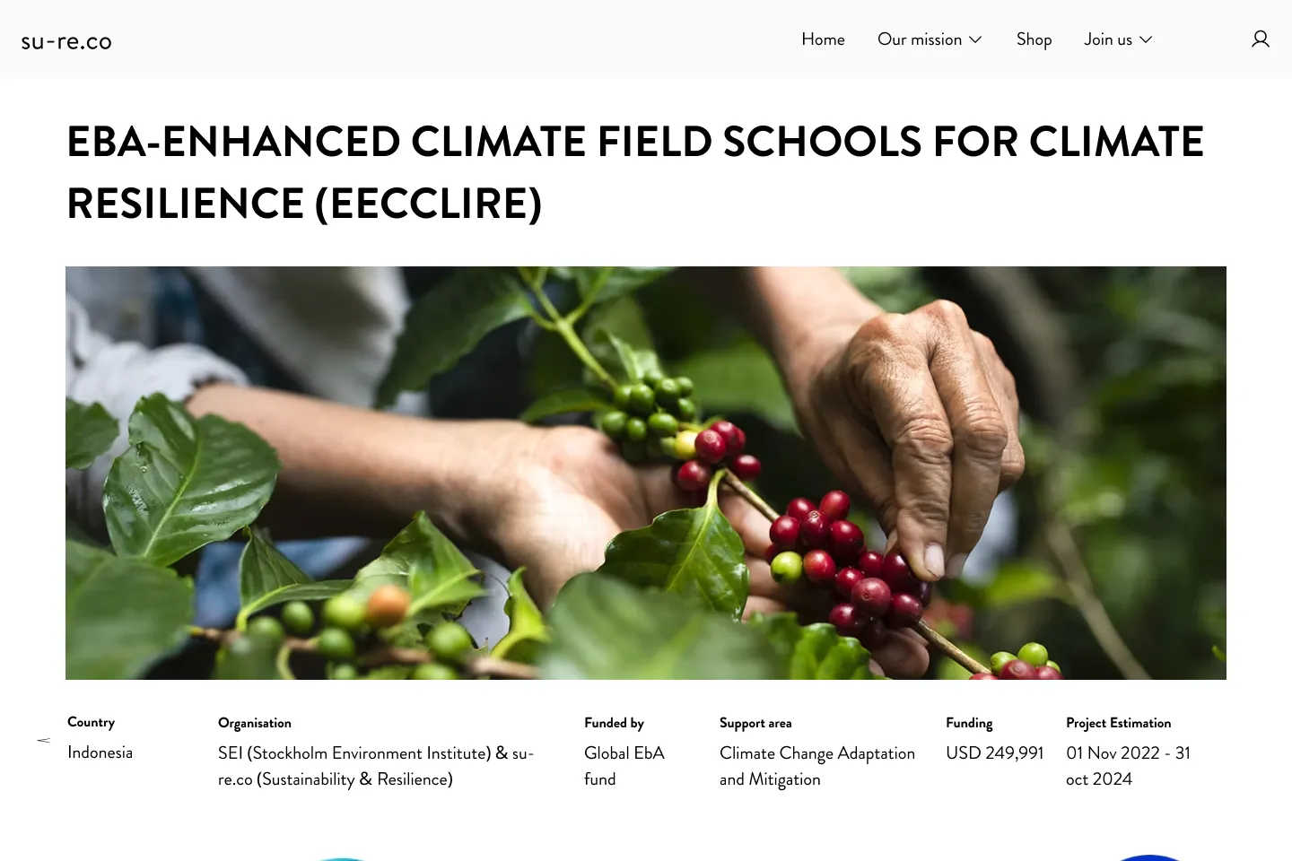
Pages now follow a clear order. What this is, who it's for, what to do next. Project details show country, funder, support area, and budget as one consistent block. New programmes can be added without the layout drifting again.
What We Did
- Audited existing pages and catalogued recurring layout problems
- Rebuilt the type scale and spacing rhythm to restore hierarchy
- Standardised programme and project pages onto one shared layout
- Restructured long-form copy into scannable, clearly entry-pointed sections